Coloured Mandelbrot fractal in generativepy
- Categories:
- generative art
- fractal
Following on from the previous article on the Mandelbrot set, we will now see how to create a colour image. it is worth reading the previous article first, as we will be building on the code in that article.
Adding some colour
The black and white Mandelbrot is a little stark, and while it might be mathematically very interesting it lacks a little visual appeal.
There is something we can do fairly easily to rectify this. The calc function doesn't just return a true or false value. It returns:
- 0 if the point is inside the set.
- Otherwise, it returns
i + 1, whereiis the count of how many times the loop executes before the value ofx*x + y*yexceeds 4 (the point of no return).
As you might expect, points that are a long way outside the boundary of the set tend to escape very quickly. Points that are very close to the boundary take longer to escape. So we can create a bit of extra interest in our image by setting the colour of the pixels outside the boundary according to the value returned by calc.
Colorising the values
In a different article we saw how to colour a Tinkerbell fractal. We will use a similar technique here.
In summary:
- We will use
make_nparray_datato write the count values for each pixel to an integer NumPy array dimensions height x width x 1. - Use a
colorisefunction to convert the counts array to a height x width x 3 array (an RGB value for each pixel). - Use
save_nparray_imageto save the RGB data as an image.
Here is the result:
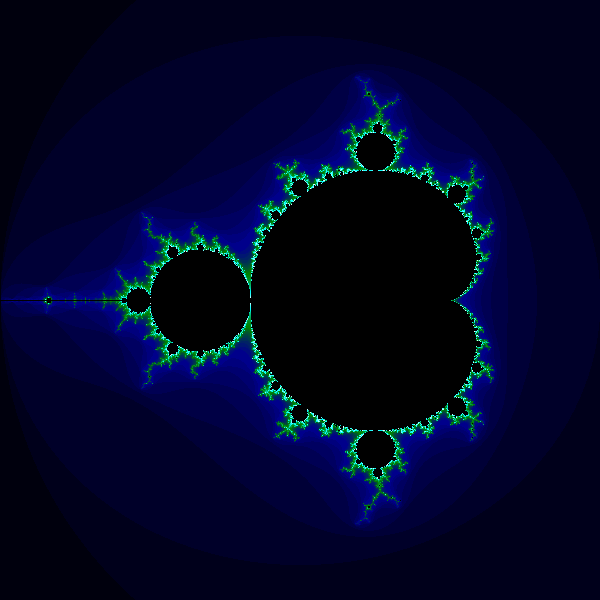
The colours around the edges of the set aren't particularly significant, mathematically. They just represent the number of cycles until the coordinates cross some arbitrary boundary. But they do look nice.
The final code
Here is the final code for the colour Mandelbrot:
from generativepy.bitmap import Scaler
from generativepy.nparray import make_nparray_data, save_nparray, load_nparray, make_npcolormap, apply_npcolormap, save_nparray_image
from generativepy.color import Color
from generativepy.analytics import print_stats, print_histogram
import numpy as np

MAX_COUNT = 256

def calc(c1, c2):
    x = y = 0
    for i in range(MAX_COUNT):
        x, y = x*x - y*y + c1, 2*x*y + c2
        if x*x + y*y > 4:
            return i+1
    return 0


def paint(image, pixel_width, pixel_height, frame_no, frame_count):
    scaler = Scaler(pixel_width, pixel_height, width=3, startx=-2, starty=-1.5)

    for px in range(pixel_width):
        for py in range(pixel_height):
            x, y = scaler.device_to_user(px, py)
            count = calc(x, y)
            image[py, px] = count


def colorise(counts):
    counts = np.reshape(counts, (counts.shape[0], counts.shape[1]))

    colormap = make_npcolormap(MAX_COUNT+1,
                               [Color('black'), Color('darkblue'), Color('green'), Color('cyan'), Color('white')],
                               [8, 8, 32, 128])

    outarray = np.zeros((counts.shape[0], counts.shape[1], 3), dtype=np.uint8)
    apply_npcolormap(outarray, counts, colormap)
    return outarray


data = make_nparray_data(paint, 600, 600, channels=1)

frame = colorise(data)

save_nparray_image('mandelbrot.png', frame)
This code is available on github in blog/fractals/mandelbrot.py.
Here is what the colorise function does:
- Reshape our counts array from
(height, width, 1)to(height, width). - Create a
colormapwithMAX_COUNT+1elements. - Create an output array that is height by width by 3, to hold RGB image data. The array is of type uint8, which is an unsigned byte value. We call
apply_npcolormapto convert the normalised count array into an RGB image array.
The colormap goes from black to dark blue to green to cyan to white. However, we have also supplied a bands array [8, 8, 32, 128]. This specifies the relative size of each band. This means that black-darkblue and darkblue-green bands are very small, but the green-cyan band is bigger, and the cyan-white band is even bigger. This equalises the transitions over the image. so that the less interesting areas well away from the fractal boundary have subtle colour changes, whereas the exiting bit of the image is enhanced by a rapid green-cyan-white change.
You can easily experiment with other colour schemes.
Things to try
Here are a few things to try with the basic code.
Experiment with other colour schemes, you can use any scheme you like by modifying the colorise function. Remember that the outer areas of the image are mainly quite low values, whereas most of the higher values are concentrated closer to the edge of the set.
Create a super high-resolution image by increasing the pixel dimensions you pass into make_bitmap. The scaling will automatically ensure that the same region of the image is visible. Be aware that every time you double the width and height the image will take 4 times longer to render.
Try zooming in on some other areas of the image by changing the width, startx, and starty you pass into the Scaler.